
Color and Confidence: Let Fit and Feeling Beat Color Rules
Color choices can support how we feel about ourselves when picked with intention. Red signals energy and assertion. Blue and green signal calmness and competence. Yellow and orange lift mood and warmth. Neutrals offer protection and polish. Pick one color today. Wear it as an accessory or a top. Notice what shifts.
TL;DR:
- A review of 132 studies, with 42,266 participants across 64 countries, found consistent color and emotion links, shaped by personal history and setting.
- Brightness and saturation can matter more than hue: brighter, more vivid shades tend to raise arousal, while darker, muted versions can feel protective.
- Test one shade for three consecutive days, tracking mood and recording confidence on a 1 to 10 scale before deciding whether it belongs in your routine.
- A neutral base with one accent is a low risk formula, while complementary color pairs suit visibility more than comfort.
Table of Contents
- Why Colors Influence Feelings and Confidence
- Color Map: What Each Shade Signals and How to Wear It
- How to Apply Color to Build Daily Confidence
- Why the Same Color Doesn’t Work for Everyone
- A Quick Checklist to Build Color Habits
- How Mr. Happiness Builds Color Into Everyday Confidence
- The Cultural and Contextual Meanings of Color
- Combining Colors for a Confident Personal Style
- Color as Non-Verbal Communication
- How Color Choices Have Shifted Daily Confidence
- Moving Past Color Stereotypes and Anxiety
- Color as Identity Work
- Wear the Reminder: Color-Curated Pieces From Mr. Happiness
- FAQ
- Sources
Why Colors Influence Feelings and Confidence
Color reaches the brain before words do. Bright, saturated hues pull attention and raise arousal. Dark, muted tones calm the nervous system and slow attention down. This is not a theory we invented. A systematic review covering 132 peer-reviewed studies, 42,266 participants across 64 countries, found consistent links between color categories and emotional states across more than a century of research.
Across numerous studies spanning over a century, light and bright colors consistently paired with positive emotion, while dark and muted colors paired with negative or low-arousal states. That consistency holds across continents and methods, which means the associations we carry around red, blue, or gray are not random.
The correspondences are reliable, but they are not automatic triggers. Research on color-emotion links shows these patterns hold across cultures and decades, yet the actual emotional payoff depends on context and personal history. A color communicates a shared meaning. Whether that meaning becomes a felt boost in confidence depends on the goal behind wearing it.
This is where color-in-context theory matters. The same red that reads as bold at a presentation might read as aggressive at a funeral. Context sets the frame, and the frame decides whether a color helps or works against us.
There is also a two-way mirror at play. Observers read color as a social signal: status, warmth, seriousness. Wearers read their own color choice back, using it to confirm or shift how they see themselves that day. Confidence from color is rarely just decoration. It is a small negotiation between how we want to be seen and how we end up seeing ourselves.

Color Map: What Each Shade Signals and How to Wear It
Every color carries a rough emotional signature, but lightness and saturation adjust the volume. A muted navy reads differently than an electric royal blue, even though both are “blue.” Use the base associations below as a starting point, then tune brightness and saturation to match the moment.
- Red: high-arousal and assertive. Experimental work on the “red effect” found that wearing red increased participants’ self-rated attractiveness, and observers in some of those studies rated red-wearing people as more dominant. Save red for short, high-stakes moments: a pitch, a date, a day you need visible energy.
- Blue and green: steady and competent. These tones support a calm presence, which makes them a dependable choice for interviews, meetings, or any setting where composure reads as credibility.
- Yellow and orange: upbeat and approachable. Best worn as accents rather than head-to-toe statements, since a small dose lifts mood without overwhelming a look.
- Pink and purple: can read as positive and empowering, but the effect depends heavily on saturation. A soft blush feels different from a saturated magenta, even though both sit in the same hue family.
- Neutrals: black, white, and gray can signal sophistication or act as a shield. The difference is intention. Reaching for gray because it feels sharp is not the same as reaching for gray because color itself feels risky.
Lightness and saturation often matter more than hue. The same systematic review found that brighter, more saturated colors raise arousal and positive valence, while darker, desaturated versions lower arousal and can feel protective. Before picking a hue, decide how much volume we actually want that day. A pale yellow cardigan and a neon yellow jacket are not interchangeable tools.
How to Apply Color to Build Daily Confidence
Testing color does not require a closet overhaul. Small, reversible changes reveal what actually works before we commit to bigger ones.
- Pick one color goal for the week. Decide whether we want calm, energy, or warmth before opening the closet.
- Start small. A scarf, a cap, or a single colored top tells us more in one wear than a full outfit change.
- Build outfit formulas. Pair a neutral base with one accent color for everyday wear, or go tonal (several shades of one color) when we want quiet presence without loud contrast.
- Check fit before blaming the color. A well-fitted piece amplifies whatever the color is doing; a baggy or tight one can cancel the effect out entirely.
- Match color to the goal of the day. Commanding a room calls for a different choice than settling nerves before a quiet one-on-one.
- Write down the reaction. A one-line note on how the day felt turns a guess into a pattern we can repeat.
Pro Tip: Test one color for three days in a row before judging it. One wear can be a fluke; three gives us a pattern.
Fit and fabric are not side notes here. A heavyweight cotton piece that sits right on the shoulders carries a color’s effect further than a thin, ill-fitting version of the same shade. Color sets the tone; fit decides whether that tone lands.
Why the Same Color Doesn’t Work for Everyone
Color-emotion links are consistent across groups, but consistent does not mean identical. A color that reads as “confident” on average can still feel wrong for a specific person because of complexion, personal history, or a memory tied to that shade.
- Expect many-to-many relationships. The same color can trigger different reactions in different people, and the same person can react differently to the same color in different seasons of life.
- Test before trusting a theory. A mirror check, a phone photo in natural light, and a short-wear day are more useful than any color chart.
- Adjust lightness and saturation before abandoning a hue. If navy feels flat, a brighter cobalt in the same family might solve it without starting over.
- Notice the difference between a protective neutral and an avoidant one. Reaching for black because it feels sharp is different from reaching for it because every other color feels too exposed.
Personal color work is less about finding the “right” shade and more about noticing which version of a shade actually moves the needle for us.
A Quick Checklist to Build Color Habits
- Pick one color goal for the week: calm, energy, or warmth.
- Try one item in that color. Keep it small and reversible.
- Take a quick before-and-after photo for reference.
- Rate confidence on a scale of 1 to 10 before and after wearing it.
| Test length | What to track | When to repeat |
|---|---|---|
| 3 to 7 days | Confidence rating, mood, comments from others | Weekly during the first month |
| 1 month | Which colors got repeated without thinking | Monthly habit check |
Reflection prompts worth keeping nearby: Did the color change how we moved or spoke that day? Did anyone comment, and did that comment match how we felt? Would we reach for this color again without prompting?
How Mr. Happiness Builds Color Into Everyday Confidence
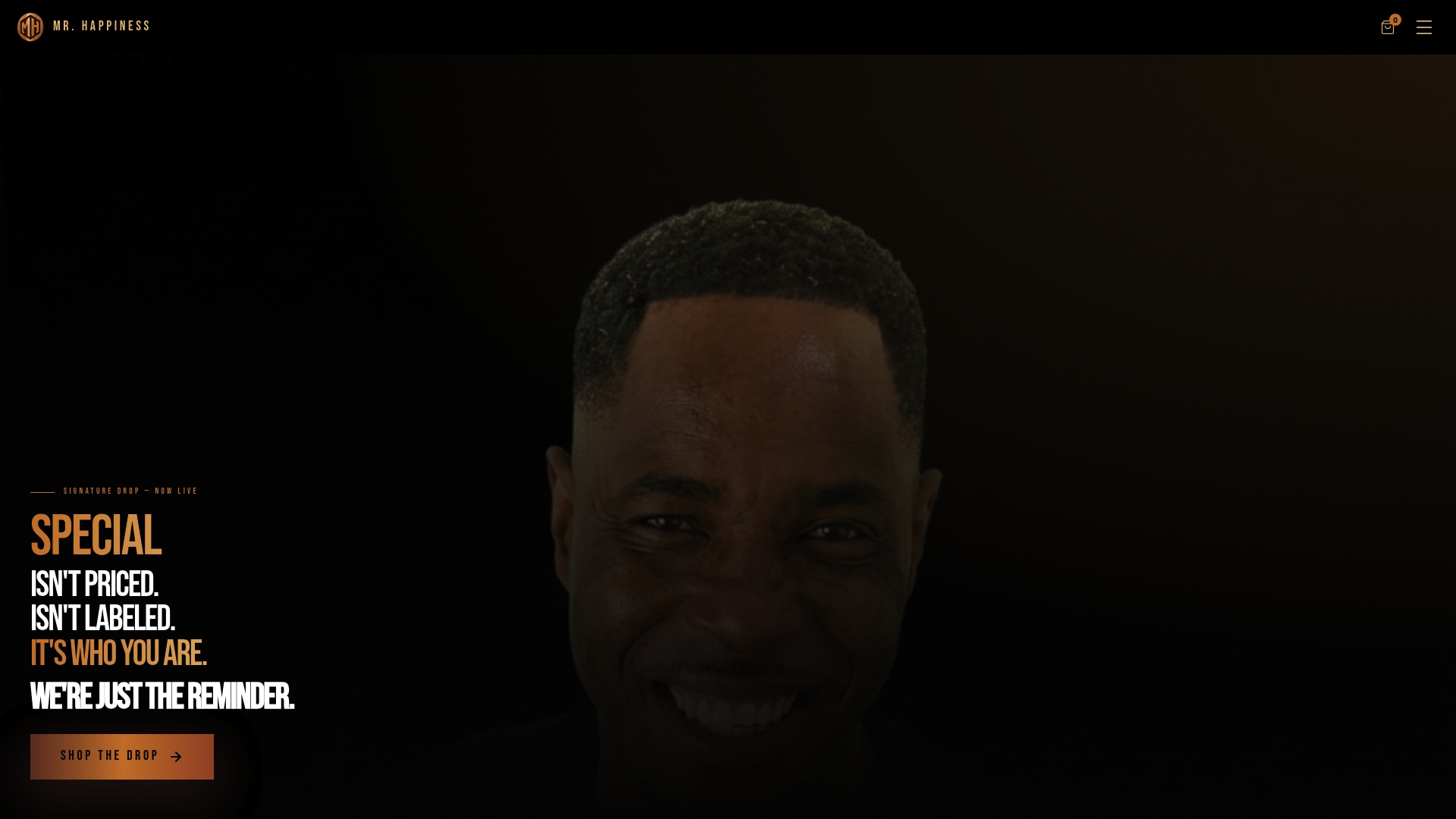
Mr. Happiness designs streetwear around one idea: special is not priced or labeled, it is already who we are. Every piece is built to carry that reminder into daily wear, not just into a closet.
- Hoodies, T-shirts, joggers, and caps, offered in various colorways for targeted experiments.
- Heavyweight cotton construction, built for fit and durability.
- Colorways chosen with attention to supporting personal style and mindset.
- One practical starting point: pick a single piece in a target color and run it through the checklist above.
The Cultural and Contextual Meanings of Color
A color’s meaning is rarely fixed. Red reads as luck in some traditions and warning in others. White signals purity in some contexts and mourning in others. These layered meanings do not cancel each other out; they stack on top of personal history, forming the lens through which we read our own reflection.
Color-in-context theory explains why this matters for confidence specifically. The same navy suit can feel authoritative in a boardroom and oddly formal at a casual dinner, because the setting changes what the color is being asked to do. Self-perception follows the same logic. Wearing a color that clashes with the room’s unspoken rules can undercut confidence even when the color itself “should” feel empowering on paper.
This is also where personal and cultural history overlap. A color tied to a childhood uniform, a former job, or a specific memory carries weight that no general color chart accounts for. Before leaning on a popular association like “blue means trust,” it helps to ask whether that color carries any private baggage worth noting. Context, both cultural and personal, decides whether a color choice reads as confident or simply out of place.
Combining Colors for a Confident Personal Style
Confident color pairing is less about matching and more about contrast with intention. A few reliable formulas cover most situations without requiring a color degree.
Tonal dressing, several shades of one color worn together, creates quiet presence without visual noise. It works well on days that call for steady composure rather than attention. Base-plus-accent works the opposite way: a neutral foundation (black, gray, navy, white) anchors the look while one accent color, a jacket, a cap, a single bold piece, carries the energy. This formula is forgiving because the neutral base absorbs any risk the accent color takes on.
Complementary pairings, colors that sit opposite each other on the color wheel, read as bold and intentional, but they ask for confidence to pull off rather than create it from scratch. Save these combinations for days when the goal is visibility rather than comfort.
The simplest rule across all three approaches: let one color lead. A look with three or four colors fighting for attention tends to read as cluttered rather than confident, no matter how good each individual shade looks on its own.

Color as Non-Verbal Communication
Before we say a word, color has already spoken. Observers form fast impressions based on color choice alone, often faster than they process posture or facial expression. A red top can register as assertive before a single sentence is spoken; a soft pastel can register as approachable in the same split second.
This social reading cuts both ways. Studies on the “red effect” found that observers rated people wearing red as more dominant than those in other colors, even when nothing else about the interaction changed. That outside perception can feed back into how the wearer carries themselves for the rest of the day, a small feedback loop between what others see and what we end up feeling.
Dressing with non-verbal communication in mind is not about performing for an audience. It is about choosing a color that matches the impression we actually want to make, so the signal we send lines up with how we want to feel once the room notices.
How Color Choices Have Shifted Daily Confidence
Color experiments tend to show their value in small, specific moments rather than dramatic transformations. Someone who defaults to gray every day might notice a shift in posture the first time they wear a saturated green to a meeting, not because the color is magic, but because it forced a small, visible decision to show up differently.
Others notice the opposite pattern: a period of reaching for darker, more muted pieces during a stretch of low confidence, then slowly working brighter tones back in as that confidence returns. That pattern lines up with research linking darker, desaturated preferences to protective or withdrawal states. The color was not causing the mood; it was tracking it, and changing it back was one small lever among several.
The common thread across these everyday experiments is specificity. A single bright scarf on an ordinary Tuesday tells us more about our own reaction to color than a general rule ever could. Testing in small, repeatable doses, exactly the approach outlined in the checklist earlier, turns color from a guess into a pattern worth trusting.
Moving Past Color Stereotypes and Anxiety
Some colors come loaded with baggage before we even try them. Pink gets dismissed as “too soft.” Black gets treated as a default instead of a choice. Bright colors get labeled as attention-seeking by people who have never actually worn them.
Most of this resistance traces back to someone else’s rule, not a personal reaction. The fix is not to argue with the stereotype directly. It is to run a small, private test and let the result speak instead. A single afternoon in a color we have avoided for years often tells us more than a decade of secondhand opinions about what that color “says.”
Worth remembering: a color choice is reversible. Trying orange for one day and deciding it is not for us costs nothing. The anxiety usually comes from treating a color experiment like a permanent identity decision rather than the small, low-stakes test it actually is. Lower the stakes, and the stereotype loses most of its grip.
Color as Identity Work
Small color changes rarely announce themselves. A brighter cap one morning, a different jacket than usual: each is a quiet test of who we’re choosing to be that day. We’ve found more value in staying curious than in hunting for one perfect shade. Try the checklist above. Let the results surprise us.
— Kofi
Wear the Reminder: Color-Curated Pieces From Mr. Happiness
Mr. Happiness exists for the days we need the reminder close: special was never priced, labeled, or handed to us by anyone else.
- Hoodies, T-shirts, joggers, and caps in colorways built for exactly the kind of small, intentional experiments covered above.
- The “Mindset Over Opinion” Pants pair heavyweight fit with a message built for daily wear, not just a closet.
- A bright tank, like the Oversized Summer Muscle Tank, works well as a mood-lift piece for a short energy test.
Pick one piece. Run the checklist. See what shifts. Browse the full Mr. Happiness catalog to find the color that fits today’s goal.
FAQ
Which three colors do confident people tend to wear?
There is no fixed “confidence trio” backed by research, but red, blue, and black come up most often in color-emotion studies. Red links to self-rated attractiveness and perceived dominance, while blue and black tend to read as calm, competent, or polished depending on fit and context.
What color signals insecurity or low confidence?
No single color universally signals insecurity, but very muted, dark, and desaturated tones are more often linked to withdrawal or protective dressing. Research on color dimensions found that darker, less saturated colors generally pair with lower arousal and more negative or guarded emotional states.
What do color preferences reveal about someone’s mindset?
Color preferences reflect a mix of mood, personal history, and cultural association rather than a fixed personality trait. A long-running systematic review of color-emotion research found that brightness and saturation track emotional arousal more reliably than any single hue does on its own.
Which color is considered the most calming or comforting?
Blue and green consistently rank as the most calming colors across color-emotion studies, largely because of their lower arousal association. Color-in-context research notes that the calming effect still depends on the setting and the wearer’s goal in that moment.
Sources
- Do we feel colours? A systematic review of 128 years of psychological research linking colours and emotions (PMC)
- The effect of red color on perceived self‐attractiveness (European Journal of Social Psychology, Berthold et al.)
- Consistent color–emotion correspondences across studies (Jonauskaitė & Mohr)